
Introduction
Using data to make decisions is a given in today’s world. Good data visualizations can be very helpful in our data-driven decisions. But there are many ways to visualize data, and choosing the right one is important. Picking the wrong “dataviz” can cause confusion and bad decisions.
This blog intends to provide help in understanding how to pick the right visualizations and makes the case for why we need standardized data visualization.
Choosing the Right Visualization
Picking the right way to show your data is not as easy as it looks; it can be hard. Should you use a bar chart, a pie chart, a scatter plot, or a line graph? Here are some basic tips:
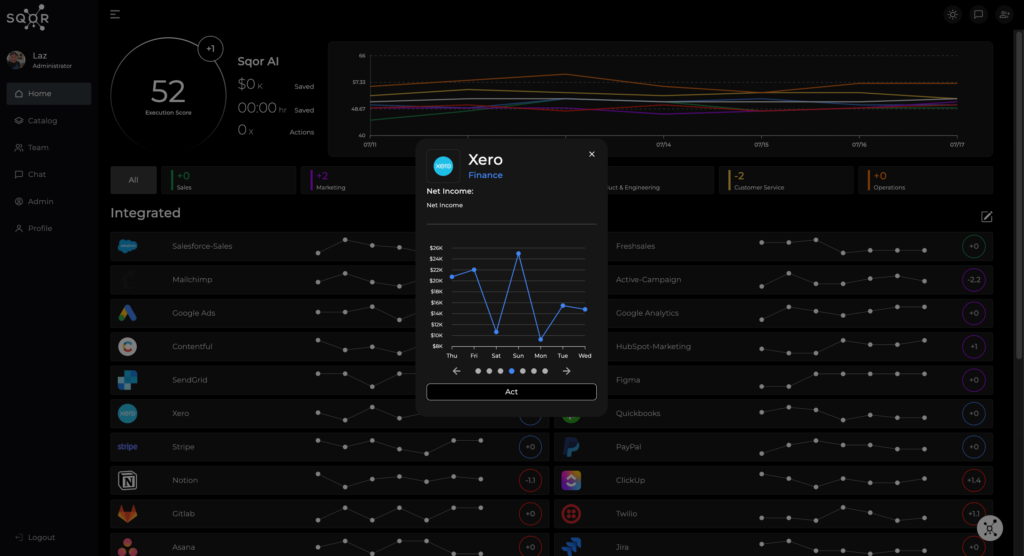
Screenshot taken directly from SQOR.ai’s dashboard
- Line Graphs: Best for showing trends over time. They highlight changes in data over periods.
- Bar Charts: Good for comparing amounts across different categories. Use them to show separate, individual values.
- Pie Charts: Useful for showing parts of a whole. But they can be confusing if there are too many categories or small differences.
- Scatter Plots: Great for showing relationships between two things. They help find patterns, clusters, and outliers.
Using the wrong type of chart can mix up your message and can result in delayed or bad decisions. For example, a pie chart for time series data would be confusing and misleading.
The Case Against Reinventing the Wheel: Standards
Do we need new ways to show revenue, customer satisfaction, or market trends? No. Too often you find data teams wasting time and money reinventing how data is presented. It is a common mistake to try to call innovation simply being different.
The rules for data do not change much. It is what it is. That’s why we focus on standardizing visualizations to make things clearer and more efficient. And here is a very important point: the data is not the point. Decision-making is the point. Anything that delays, confuses, or in any way obstructs that is a problem.
Here’s a few reasons why standards work:
- Consistency: Standardized data visualizations give us a common way to understand data. This helps teams and stakeholders trust the data.
- Efficiency: Standardized data visualizations save time on deciding how to present data, leaving more time for analysis.
- Accuracy: Standardization reduces the chance of misinterpreting data and ensures it’s shown correctly.
The Need for Industry Standards
Creating industry standards for data visualization is a good goal, and ensuring everyone on the team is aware will help make data more useful in the decision-making process. Standardized data visualization can serve as benchmarks, ensuring data is shown in a way everyone understands. Here’s what we need:
- Clarity: Data visualizations should be easy to read.
- Relevance: Only show the most important data to avoid clutter.
- Accuracy: Visuals should show data correctly without distortion.
- Consistency: There should be uniformity in how data is visualized across different platforms and industries.
Having these standards will improve comprehension. Improved comprehension leads to better decision-making across every sector.
SQOR Provides Standards
At SQOR, we know how important standardized data visualization is. Our platform follows industry best practices, making sure your data is clear, accurate, and timely. We offer the right visualization for the KPI data provided to help you make better decisions faster, so that you do not miss opportunities or issues. Whether you’re a CEO, CFO, CMO, COO, CRO, or CTO, our solutions are designed to meet your needs.
At SQOR, we believe that seeing the data flow directly from the SaaS tools where the data is being generated, without human interference, is crucial. This ensures that the data remains pure and unaltered, providing a clear picture. And we use AI to detect anomalies or fraud, alerting stakeholders to any issues.
By using standardized data visualization, we can make the most of our data, improving decisions, and ultimately improving business outcomes for all stakeholders; internal and external.
Let’s stop reinventing the wheel and start standardizing our data visualizations. And above all, remember that it’s all about decision-making.
Check out how we’re standardizing our data visualizations for greater clarity and efficiency by clicking here.